You might be on the hunt for some homeware décor inspiration, thinking of trying your hand at some DIY, or looking to spruce up that bland corner that you’ve never really know what to do with – and if you’re in need of some guidance, then we’re here to help!
Renovation, redecoration and upcycling furniture has all been particularly popular over the last 18 months, and it’s no secret that trends are ever-evolving and adapting. With this in mind, we’re taking a quick look at what’s set to be en vogue over the next 12 months – and we’d love to know which of these trends you’ll be hopping on to!
Colour that makes you feel good
We’re looking at the next 12 months, and expect that a complement of comforting colours will be a key trend. It’s all about colours that make you feel good – really, the trend is just about designing and creating rooms that reflect what you like, and that give you a mood boost whenever you walk through the door.
Calming, dreamy blue and purple tones can help to create the peaceful atmosphere that we’re all so desperately craving, while bright colours like yellow can work to make us feel happy and welcomed, and soft, joyful pinks aid in creating a feel-good interior vibe.
After living through the last 18 months, embracing these colours and adopting trends that make you happy can help to bring life and energy to the home – just what we need to help us feel good and positive. We’ve seen an increase in the ‘maximalism’ trend, which really just tells us that people want their homes and its rooms to spark joy – especially since we’ve been spending so much more time there.
Making the blues comforting
Blue is a colour that’s never really out of style – it just takes a different form every year. And while we normally associate ‘the blues’ with being sad or morose, it’s actually a very grounding, comforting and familiar colour – perfect for changing up your home décor!
We reckon that deep blues are more likely to be ‘on trend’ in the next 12 months, and it’s more about bringing in and embracing the darker shades for your painted spaces, not just bringing in blue furniture or textiles to an already-neutral room. Opting for an all-over inky shade of blue created a cocoon-like feeling, and can bring a touch of the dramatic to your home.
Blue is bold and brave, but it also brings warmth, plus it offers a great base for your paintings and artwork, as they’ll really stand out against the dark colour – much more so than on a white or neutral background. It’s a big change and can take a while to adapt to, but after a few days of acclimatising to the new colour, we’re pretty confident that you’ll love it and it’ll bring a sense of calm to your room.
Get inspired by nature
2020/21 were the years we really ‘got back to nature’, especially as the daily walks outdoors were the only thing to keep most of us sane throughout the lockdowns! So it’s no surprise that nature has seeped into décor schemes, in cities and rural towns alike as we bring inspiration from leaves, flowers and trees into our homes.
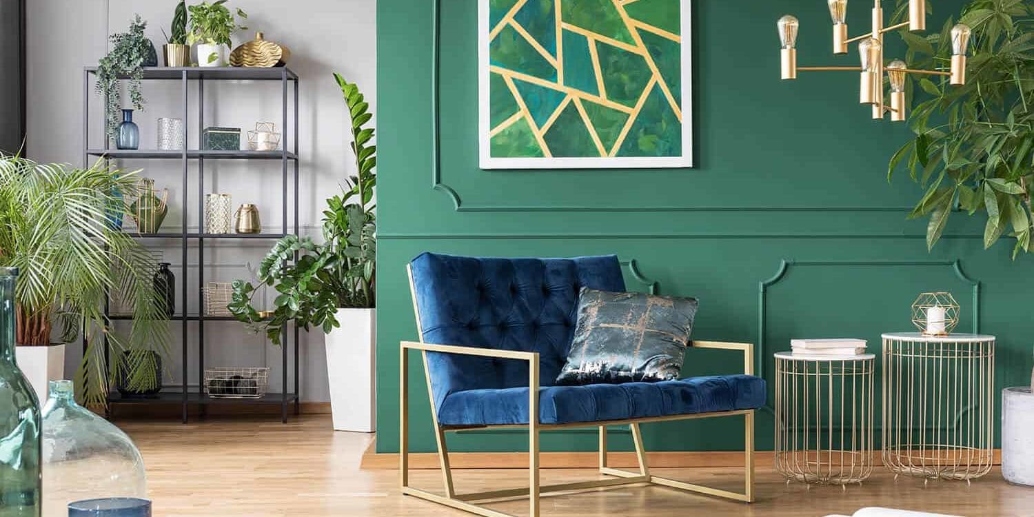
While greens are a great way to bring nature into your home, they’re also known to bring in feelings of reassurance, rest, and safety – it’s great for putting your mind at ease and that’s likely why it’s become so popular after the turbulence and uncertainty of the last 18 months.
While darker greens might seem bold and intimidating to some who are used to softer, more neutral colours, taking the plunge is the best way to allow the colour to fully encapsulate the space. And you can even take it one step further by including the ceiling in your new colour scheme – it seems drastic, but looks amazing!
Grey is on its way out
Once the favoured colour scheme, we can confirm that cool greys are on their way out – and it’s now about embracing warm, earthy tones. Shades such as terracotta, ochre and even beige are an easy way to add instant warmth to your living space, making them feel comforting, safe and inviting.
Much like the greens we discussed previously, it’s becoming increasingly popular to bring in earthy colours which reflect bringing the outdoors, indoors. Pairing warm, earthy tones with pops of colours can stop a neutral pallet from feeling too draining, or mood-lowering and really helps to liven them up.
And if these colours seem familiar, you’re right in thinking that we’re living through a 70s revival in terms of the colours we’re all opting for – but as long as shag rug carpets stay in the 70s then we’re okay with it!
Retro is back, and by mixing together the right colours, textiles, artwork and furniture it’s easy to give the 70s and 80s a nod without feeling like we’ve stepped into a time machine.
If you’ve been thinking of sprucing up your home and embracing some new colours, then this is your signal to take the plunge and go for it! Adopting any of the trends discussed here is a great way to inject some colour into your home, while still enjoying the feelings of warmth, calm, comfort and safety that we love from being at home. And if you have the colour scheme in mind but are worried about your technical painting skills, that’s what we’re here for – get in touch and see how we can help!


