With the gloomy, dark winter seemingly behind us (hopefully!), now is the perfect time to refresh and rejuvenate your home with a fresh coat of paint as we enter spring. The latest colour trends for 2025 are all about warmth, comfort, and creating inviting spaces. Whether you’re looking to add a touch of elegance, a pop of vibrancy, or a sense of calm to your space, this year’s top paint colours offer plenty of inspiration.
From soft neutrals to earthy greens and rich, warm tones, 2025’s spring colour palette is designed to bring harmony and balance to your home. In this blog, we explore trending popular paint colours of the season, provide some ideas on how you can incorporate them into your living spaces and offer tips to help you choose the right colour scheme for your home.
Top Trending Paint Colours for 2025
Mocha Mousse
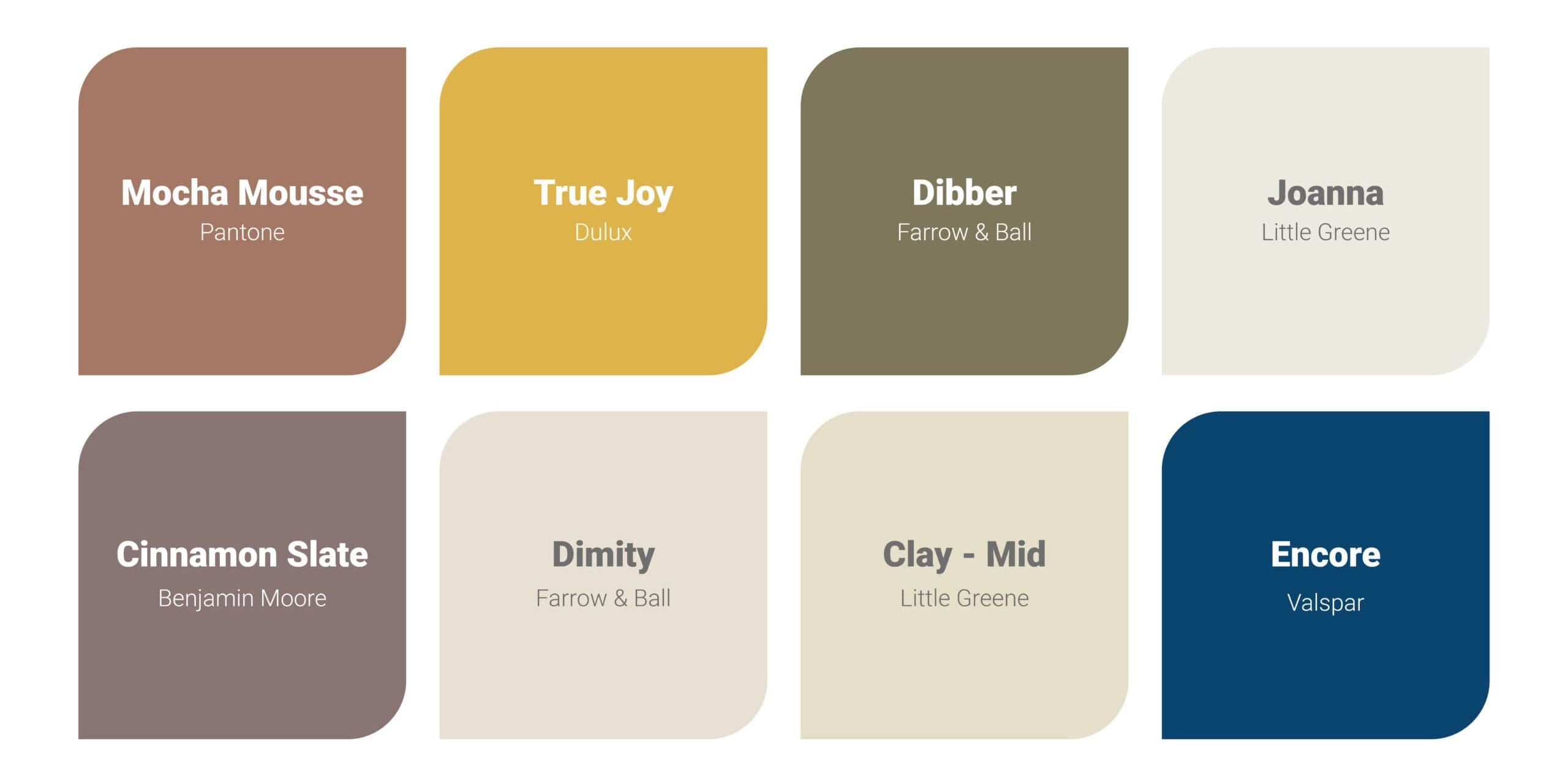
Pantone Colour of the Year for 2025 has been named as Mocha Mousse. This rich, warm shade is a perfect balance between brown and taupe, providing both sophistication and comfort. Mocha Mousse is a highly versatile colour that can be used to create a cosy yet refined atmosphere in various spaces. It pairs beautifully with natural materials like wood, linen, and stone, making it an excellent choice for contemporary and traditional interiors alike. The earthy undertones make it an ideal choice for open-plan spaces, ensuring a seamless flow from one area to another.
Buttery Yellow
The 2025 Colour of the Year for Dulux is Buttery Yellow, a soft yet uplifting shade that radiates warmth and positivity. Reminiscent of springtime sunshine, this colour brings a cheerful energy to any room. It works particularly well in spaces that need brightening, such as kitchens and hallways, and can be used as an accent to add a playful touch to a neutral colour palette. The golden undertones of Buttery Yellow ensure it remains warm and inviting rather than overpowering, making it a fantastic choice for both traditional and modern interiors.
Deep Earthly Greens
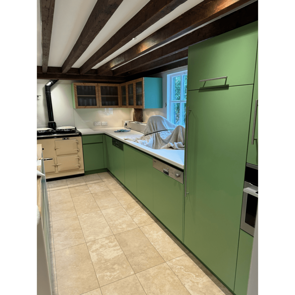
Green is a colour that remains popular for its connection to nature and its calming effect on interiors. Dibber by Farrow & Ball is a deep, earthy green that provides a rich and elegant backdrop, perfect for those looking to bring a touch of the outdoors inside. This bold and grounding shade works particularly well in rooms where you want to create a sense of relaxation and tranquillity. The depth of Dibber allows it to be paired with a variety of complementary tones, from muted neutrals and warm ochres, allowing for a natural aesthetic.
Plum & Browns
Benjamin Moore has introduced Cinnamon Slate, a beautifully balanced blend of plum and brown tones. This shade is perfect for those looking to add warmth, richness, and depth to a room. The blend of deep, earthy hues and subtle red undertones creates a sense of timelessness, making it an excellent choice for formal dining rooms, cosy bedrooms, and accent walls in contemporary living spaces. When combined with soft lighting and rich textiles, Cinnamon Slate can transform a space into an inviting sanctuary of comfort and style.
Warm Beige & Taupes
Neutral shades continue to be a staple in interior design, and warm beige and taupes remain a favourite for their versatility and timeless appeal. Farrow & Ball’s Dimity as well as Clay Mid and Joanna by Little Greene provide a soft, understated elegance that suits any home. These tones work particularly well in spaces where a sense of calm and cohesion is desired. They serve as the perfect backdrop for layering different textures and materials, ensuring a warm and welcoming atmosphere in any room.
Rich & Deep Blues
For those looking to add depth and luxury to their home, Valspar’s Colour of the Year for 2025 is Encore, a rich, deep blue that exudes style. This shade is perfect for creating a bold yet timeless aesthetic, making it a fantastic choice for feature walls, cabinetry, or even entire rooms with the right lighting. Deep blue tones work exceptionally well when paired with warm neutrals, gold accents, or natural textures like wood and stone. Its luxurious yet calming presence makes it a great option for multiple areas of a home such as bedrooms, bathrooms, studies, and living areas, bringing a sense of serenity and refinement to any space.
Ways to Utilise These Spring Colours
Living Room Walls
A fresh coat of paint in one of these trending shades can completely transform your living area. Living room colour ideas such as Mocha Mousse, Buttery Yellow or similar shades can make a room feel bright and inviting, while deep greens and rich blues add depth and sophistication. Plum and browns work beautifully for feature walls, adding richness and character.
Kitchen Cabinets
Refurbishing your kitchen cabinets and adding a fresh colour is a great cost-effective way to bring new life to your kitchen. A deep colour on kitchen cabinets can create a striking and stylish aesthetic. Earthly greens, plum and browns work well for a warm, luxurious feel, while rich, deep blues are ever-increasingly popular kitchen paint colours, making a bold statement when paired with brass or gold hardware. For a brighter, summery feel, Buttery Yellow or similar tones are great paint colours for kitchens to add warmth and charm.
Wall Panelling
A trend that looks set to stick around for the foreseeable. Wall panelling painted in a rich, warm shade like Cinnamon Slate or Mocha Mousse will add depth and texture to any space. If you’re looking to bring a touch of class to a room, rich blues such as Encore on panelling in a living room, study or hallway creates a luxurious, contemporary look.
Ceiling and Trim Accents
Instead of traditional white ceilings and trims such as skirting boards and coving, try using a warm beige or taupe such as Dimity, Clay Mid or Joanna for a soft contrast. For a striking effect, matching deep, rich wall colours with trim details can add a modern, stylish touch that frames your walls beautifully.

Front Doors & Exteriors
The colour of your front door sets the tone for your home. How to paint your front door and the right colour for you comes down to preference and the look and feel you want to give off. A bright, bold colour such a Buttery Yellow will create a warm, inviting entrance, while richer, deeper colours can provide a touch of class to your front door. If you prefer a timeless look, opt for colours such as Mocha Mousse or a warm beige for your exterior.
Bedrooms & Bathrooms
Soft neutrals like Dimity or Clay Mid can create a restful, calming feel in bedrooms. For a moodier, more intimate feel, use rich blues, deep greens or a shade such as Cinnamon Slate on bedroom walls, pairing with warm-toned lighting and plush textiles. Rich greens and blues work equally well in bathrooms when paired with white marble and gold fixtures to create a grand, spa-like feel.
Home Office or Study Nooks
Productivity meets style when you incorporate deep, bold colours in a study or home office. A rich, deep blue is a fantastic choice for creating a sophisticated and inspiring workspace, especially when paired with wooden furniture and warm lighting. Alternatively, Dibber and similar tones can add a grounded, natural touch to a reading nook.
Final Thoughts
We believe grey and cool colours will be replaced this year with beiges and taupes and bold colours such as deep blues and greens will continue to rise in popularity for things such as feature walls and kitchens.
Spring is the perfect season for a fresh start, and updating your home’s colour scheme is a great place to start. The paint trends of 2025 reflect warmth, nature, and positivity, making it easy to find a shade that suits your space and style.
From, interior walls and trim, doors and cupboards, wall panels and window sills and frames, through to exterior painting and decorating and external maintenance, our experienced team of painters and decorators are here to help transform your space this spring. Contact us today to discuss your project and receive a free, no-obligation quote.


